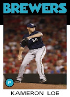
As far as both team logos and uniforms go, I don't think any team has fallen farther (although both the Padres and Astros are in the argument too) from 1985 to today than the Milwaukee Brewers. The MB glove logo is one of my favorites of all time and the older uniforms had some character. The modern Brewers look is just generic and unappealing. Are there any other teams you feel have gotten worse with age? While you mull that over, here is the second half of the 2012 Milwaukee Brewers.
1. Martin Maldonado
2. Nyjer Morgan
3. Cesar Izturis
4. Randy Wolf
5. Jean Segura
I mentioned when I started this set that 1986 Topps is known for great catcher cards. The Brewers are yet another team in which the catcher is the best shot of the bunch. The Maldonado will be in the running for best overall of the set. The Morgan card is a fairly mundane running shot, but what sets it apart is the rain. It just gives a great look to the card. As I mentioned above, I think I would be a bigger Brewers fan if they brought back the uniforms shown in both the Izturis and Wolf cards. The current uniforms are just too generic looking. The fifth card is difficult because there were only 4 that stood out to me. I decided on Jean Segura due to the bunting action and because, as an athletic shortstop, he will probably have many great cards in the future.
The Brewers also gives us the 4th person to appear in both 1986 Topps and 2012 Quarry Unlimited, manager Ron Roenicke. Here are his cards shown side-by-side.
These side-by-side shots show me I didn't get the spacing correct on the player name. I knew it wasn't 100% accurate, but I went the easier route of centering the name and keeping all spaces relatively congruent rather than spreading each name out. This makes me feel a little better about my colors changes since it is not an exact replica set.
Speaking of color changes, join me tomorrow for team #14 the second team to have a changed team color.
Thanx for reading.


2 comments:
Although you've certainly created a fair share of tremendous cards, I think that Nyjer Morgan is the greatest of them all so far.
I absolutely love the rain falling all around the frame. What a terrific shot!
Astros have certainly gotten worse over the years.
I'd say Blue Jays, too, although they seem to be starting to reverse things a little.
Post a Comment