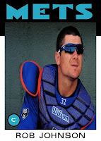
One team that is somewhat on the rise is my #20 team, the New York Mets. I am nowhere close to becoming a Mets fan by any means, but I no longer despise them. When I first started watching baseball I liked two teams, the Cardinals and the Reds. Because of this, I also hated two teams, the Mets and the Dodgers. Yes young folks, the Dodgers-Reds and Cardinals-Mets rivalries were two of the best of the 1980s. Of course, those rivalries have since lapsed due to divisional realignment. The Dodgers are still my favorite team's rival, but I still can't quite get rid of the feeling that the Mets are also the bad guys. I think it is starting to wane though, because now it just seems that the Mets don't matter that much. Maybe a few years down the road will even let me sometimes cheer for New York's "other team." Until that happens, let's take a look at some trivia along with the first half of the 2012 New York Mets.
If I were a Mets fan...
Title of the blog - Metropolitan Museum of Baseball
Favorite Player (current) - Omar Quintanilla
Favorite Player (all time) - Tom Seaver
Least Favorite Player (current) - David Wright
Least Favorite Player (all time) - Darryl Strawberry
2012 New York Mets Total Cards = 50
Thanx for reading.


2 comments:
I liked it when Topps used secondary colors with teams. It added a kind of funky edge to the cards. But the blue change doesn't bother me.
I remember the Dodgers-Reds rivalry well. God, I hated the Reds. Still have nothing good to say about Rose and Morgan.
That Byrdak card is way too clever for anything that appeared in '86 Topps.
I absolutely love that Byrdak. Terrific photo selection!
Post a Comment