A place where Colorado Rockies baseball card collectors (all 3 of us) can waste some time reading about our favorite sport. The Rockies and their cards will be the primary focus, but I like to go off on tangents as well so anything and everything baseball related may be covered here.
Showing posts with label The Best Topps Set Countdown. Show all posts

Friday, June 15, 2012

The Best Topps Set Countdown - Finale/Recap


Before I get started with the recap, I would like to celebrate my 300th posting.  WOOHOO!  Actually it's probably like 310, but I deleted a few posts here and there, but let's just forget about those.

Enough self congratulations on with the recap of The Best Topps Set Countdown.  I know a lot of you were surprised, to say the least, with my selection of 1986 as the best Topps set ever.  Honestly, I do not think it is the best design and the photography is middling at best and would probably be best suited for a spot in the 20's or 30's.  However, like I said last week without that set I wouldn't be a card collector at all.  There are a lot of things I collected as a 9 year old that I no longer even think about such as action figures, stickers, board games, bugs, rocks, etc. and baseball cards could have easily ended up on that list.  1986 Topps made me LOVE baseball cards and it will always deserve the top spot in my book.


LINKS
Let's start out with some links to the previous 12 posts for some of you to catch up on.

1-5  6-10  11-15  16-20  21-25  26-30  31-35  36-40  41-45  46-50  51-55  56-61


DECADE STATS

1950s
Highest Rated - 1954 (#3)
Lowest Rated - 1957 (#55)

1960s
Highest Rated - 1962 (#2)
Lowest Rated - 1970 (#59)

1970s
Highest Rated - 1971 (#6)
Lowest Rated - 1979 (#53)


1980s
Highest Rated - 1986 (#1)
Lowest Rated - 1982 (#50)

1990s
Highest Rated - 1991 (#4)
Lowest Rated - 1999 (#61)

2000s
Highest Rated - 2009 (#11)
Lowest Rated - 2010 (#58)


2010s
Highest Rated - 2011 (#23)
Lowest Rated - 2012 (#31)


What do the stats say?  Well not much really other than there have been really good sets and really bad sets at all times, although it does give one pause to see that my "newest" top 10 set is 21 years old.  Does this mean that Topps has stopped putting out memorable sets?  I think it is more a product of my own bias toward the sets of my youth, but most of the recent Topps product is not that great either.


CHANGES?

The more I have seen of 2012 Topps, the less I really like it.  The extreme closeups of most of the photos is really just not done well.  To top it off there is not one Rockies card that I would say qualifies for even the top 20 cards of the year.  If I were to redo this list, there would be two sets that ended up substantially lower, 1966 (which I just flat out goofed on and deserved about 15-20 spots lower) and 2012 (which would probably settle into the low 40s/high 50s).

Some that ranked maybe a tad bit too low were mostly from the 1970s, but once again that is mostly due to my age and when I started collecting.  1970s cards were too new to be vintage and too old to be modern when I started collecting in 1986, so I never really developed an attachment to those cards.  I'm sure everyone has a period like that in their personal histories as well.

But that's the great thing with a list like this.  Every other blogger could do this countdown and have a few similarities, but none would be exactly the same.  Heck even if I did it again it wouldn't be exactly the same.


THE FUTURE

I am looking forward (with trepidation) to 2013 Topps.  I think it needs to be a colorful year.  There has been way too many similarities in the past few years and we, as collectors, need a 1975-style change of pace right about now.  It probably won't happen due to parallels dominating the hobby at the moment, but I think we are due a "game changer."


I hope you all have enjoyed this feature as much as I have and I thank you for taking the time to read my (sometimes rambling) thoughts on the subject.  On Sunday, I will doing a "reboot" of sorts on this blog and I plan to get back to more regular blogging again.  But I will let you know more about the details on Sunday.  Thanks for reading.

Friday, June 8, 2012

The Best Topps Set Countdown #'s 5-1


The time has finally arrived for the top 5 Topps sets of all time, well in my opinion anyway.  This has been one of the most fun post series that I have done on this blog because it is all encompassing.  I am a team collector now with my Rockies and I do love them, but I started collecting baseball cards 8 years before the Rockies existed.  This series has allowed me to return to my roots of a pure set collector and allowed me to think critically about some of the things that I have taken for granted in the flagship Topps set.  I am not usually the most observant collector, so this allowed me to step outside my normal comfort zone and really take a look at my cards.  Some of you are really good at in-depth card observation, but for me that isn't, this is a big step forward and make me appreciate my collection that much more.  Okay, that's enough of my self evaluation.  Let's take a look at what I think are the best 5 sets in Topps history


5. 1965

PLUSES - The pennant is an extremely underused iconic baseball image.  Even though the colors are not always good, the pennant never looks bad on this set.  The card back is pretty good as well.  I like the color, especially compared to others from that era.

MINUSES - Aside from the pennant, there isn't much great about the front.  It's good, but without the pennant this is a middling set at best.


4. 1991

PLUSES - Baseball photography took a giant leap forward with this set.  You could probably name at least 10 different cards from this set as iconic images in baseball cards.  The alternate script logos on the front were a nice change of pace as well.  The 40th Anniversary watermark on the back is great.

MINUSES - This set revived the landscape orientation card for the first time since 1974 for player cards.  While they are usually great images, they look bad in pages or at least awkward.


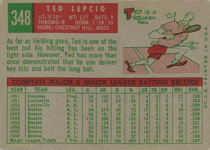
3. 1954

PLUSES - Bright, colorful set.  The large headshot with the smaller action shot behind it was very popular in the 1950s.  The big diamond logo is fantastic.  I really like the Inside Baseball strip-style comic on the back.  The fielding stats on the back are great as well and gives you a nice picture of the entire player, not just the hitter.

MINUSES - Not much here other than the facsimile signature that I have mentioned WAY too many times by now.


2. 1962

PLUSES - The photo peeling off the wood background just gives the feeling of an old poster on a fence outside a ballpark.  A great image for the times that somehow continues to hold up.  Once again, the wood background is wonderful. 

MINUSES - Why abbreviate the city names on both sides?  Perhaps using the team nickname on the front and the city on the back would have worked better than abbreviating on both sides.  Nitpicky?  Sure, but this is #2 so I have to nitpick a little in order to find something.


1. 1986

PLUSES - This is what a baseball card looks like in my mind.  The large colorful team name on a black background is probably the best ever.  I like the color matched position bubble as well.  Talkin' Baseball taught me more about the game than ESPN ever has.  The most under-appreciated aspect of this set is the use of a base for the card number.  I love it, especially since a ball was used many other times.

MINUSES - NOTHING!!!!!!!!!!!


Did I rank 1986 too high?  Perhaps, but without that set I would have never become a card collector.  I remember keeping my 86 team sets in an old tool/tackle box that had 25 drawers so I could separate by team (The White Sox and Yankees were kept together).  I had cards before this set, but never collected them.  1986 made me a collector and it will always be my favorite.  Well, unless a card of me is in a set later on, but that ship has pretty much sailed.

Night Owl (not trying to call you out just giving you credit...and hey you get a link out of the deal) mentioned last week that he didn't care much about 1987 (#9) because it was a copy of 1962 (#2).  While the borders are basically a copy, 1987 had so much more color on the front with the name box and the logo to go along with the wood.  That would be like saying every white bordered card was a copy of 1952 Topps which we would all recognize as a false statement.  But if you were going to flat out copy a set, 1962 would be a good choice.

I will be back next Friday with a recap and wrap up of this wonderful countdown.  Check me out then.

Friday, June 1, 2012

The Best Topps Set Countdown - #s 10-6


I have wondered to myself when putting this countdown together how much uniqueness and being the first at something should be weighed.  I like the sets that throw convention aside and take a risk.  Sometimes it fails miserably, as is the case of 1957 Topps or more recently 1996 Topps.  However, more often than not, the risk is well worth it.  The first example of a color photo on the back pushed an otherwise lackluster 1993 Topps up the list and the first logo on the back pushed 1984 Topps higher.  Even 2008 Topps was pushed quite a bit higher due to its unique attributes.  That's why the last four years or so of the flagship has been kind of dull.  They have mostly been conventional and not very memorable.  They haven't been horrible by any means (well except for 2010), but they haven't stood out either.  As we begin the top 10 sets of all time, there are a couple of examples in this grouping of a unique look.  With that being said, let's take a look at the next set of five.


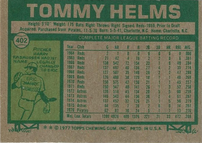
10. 1977

PLUSES - I love the large font color-coded team name at the top as well as the flag displaying the position.  I also like the all caps name on the back, it really stands out in a positive way.  For the era, the photography in this set is very good as well.

MINUSES - The dreaded return of the facsimile autograph just takes away from many of the photos.  The cartoon on the back seems out of place in this set.  I think it could have been left out.


9. 1987

PLUSES - The wood grain border is absolutely wonderful.  The logo bubble is perfectly located and really enhances the front.  Normally I am not a fan of the Topps logo, but I think it works on both the front and back of this design.

MINUSES - The lack of a player position on the front has always been a pet peeve of mine.  There was a lot of bad airbrushing in this set.


8. 1964

PLUSES - The first appearance of the large font name at the top which has always looked good.  All needed info showed up on the front.  The back feature of the coin scratch trivia question was a good idea and really works with this set.

MINUSES - The back color is just downright ugly.  Other than that there aren't many negative feelings about this set.


7. 1959

PLUSES - Fantastic colored inner borders work well with this set (even the pink ones).  The telescopic view of the player gives me a bit of a "sneaking a peek" feeling, but in a good way.  The little logo on the front pushes this set up as well.

MINUSES - I never liked that the first letters in the player's name wasn't capitalized.  It would probably make the set a little less memorable, but it would also stop my grammar OCD. 


6. 1971

PLUSES - The many firsts of this set.  The first ever black border.  The first ever player photo on the back.  A nice risky set following several bad sets.  The back in general is really different and works on most levels.

MINUSES - The one fault I have with the back is that there is only one year's worth of stats.


I really struggled with putting 1971 only at #6, because I do love the change involved with that set, but I just couldn't see any of the top five being displaced by it.  Either way, each of these five sets is great in its own way.  Some people might not like 1987,  but you can't deny that it is a memorable and iconic set.  1959 is one of those sets that climbed my personal list because of Topps Heritage.  As a kid, 1959 never really did anything for me.  However, 2008 Heritage really opened my eyes to how good the design actually was.  Has Topps Heritage changed any of your views on older designs (either positively or negatively)?  Do you look for a set that either breaks a barrier or changes things up completely or does that even matter to you?  Coming up next week will be the long awaited conclusion to this countdown which I have really enjoyed and I hope you will join me then.

Friday, May 25, 2012

The Best Topps Set Countdown - #'s 15-11


If you are like me you have noticed that the final number in a particular set has a bit of a determining factor in whether that set will be good or bad.  This year, for example, is a 2 year.  2012 Topps will always have something in common with 1952, 1972, 1992, etc., for better or worse.  While the "2 year" is not a good example of this phenomenon since there are very good sets and very bad sets, there are a couple of prime examples of this working.  I'll preface this with the obvious statement that this is my opinion only.  I'll start with the bad one which, surprisingly, happens to be the "0 year."  On this countdown, the highest "0 year" set is 1980 at #34 and 3 of the bottom 4 sets are "0 years" as well.  On the opposite end of the spectrum there is one year that give me hope for the near future.  The "3 year" has never delivered a horrible set and in most cases, great sets were produced.  The lowest "3 year" is 2003 at #28 (and some would say that was TOO low).  Is this merely an anomaly or is there something to it?  Either way it leaves me with sufficient hope for next year's offering of Topps baseball cards.  For now let's show off the next five sets on the countdown featuring 3 of the "3 year" wonders.


15. 1993

PLUSES - Clean, simple front design which really accentuates the photo.  The back is the star of this show with the first ever appearance of the full color head shot in a Topps set.

MINUSES - Not all about the back is perfect though.  The vertical orientation is once again a pet peeve of mine.  The large Topps logo on the back is also not very appealing.


14. 1963

PLUSES - Really bright and colorful, always a plus in my book.  The inset photo (not shown here but you know what it looks like) is very iconic and probably the best aspect of this set.

MINUSES - The last name is in a bigger font than the first.  I don't know exactly why, but I never liked that.  The back is unremarkable at best and flat out boring at worst.


13. 1953

PLUSES - Absolutely beautiful painted card fronts in most cases.  The logo on the front is also great, especially for those teams that have drastically changed them over the years.  The Dugout Quiz is a great card back addition.

MINUSES - Once again the vertical card back rears its ugly head.  Aside from that, the completely unnecessary red facsimile auto is just odd, especially over the text.


12. 1984

PLUSES - The first ever appearance of the logo on a card back which should have never taken 32 years to happen.  A really good looking card back for the era as well.  Although I usually hate vertical writing, I like the vertically oriented team names in this case. 

MINUSES - The front design is a little too similar to the prior year knocking it down a few spots. 


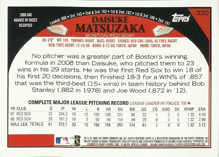
11. 2009

PLUSES - Fantastic photography in most cases on a very clean design.  I really the use of the plate with the rarely used alternative logos as well.  I like the oddball stats above the arch in most cases (excluding the six degrees of Mickey Mantle).

MINUSES - The Mantle stat mentioned above.  I don't really get the circular "arched" shape of the back.  Most of the time the back mirrors the front, but this one seems odd somehow.


What did you think of this grouping?  Some too high?  Some too low?  Did I forget a better example of the "decade phenomenon"?  As always yours comments are highly encouraged, because without them I am just writing a diary.  Tune in next week for the start of the Top Ten.

Friday, May 18, 2012

The Best Topps Set Countdown - #'s 20-16


Today's word for the day is parity.  I am not talking about the usual sports definition of parity, the level of competition within a particular league, although that is important as well.  I am talking about a card company offering an equal portion of cards for each and every team within a set.  Obviously as a Rockies collector, I can shoot off about 20 sets in which my team received the short end of the stick, but none of them will be the Topps flagship set.  That is one of the main reasons that I started this countdown, not only because the Topps flagship set is the best known set of a particular year, but it also usually the most equitable.  Equality of teams is one big thing I look for in choosing a set to collect.  You may have noticed in this countdown that I have diversified among all of the teams as well.  I chose exactly two cards for each franchise as examples for the card fronts with the exception of the Senators/Twins who got three.  Why the Twins?  Well, I was one year short of having an example card for every year and the Senator was the cheapest I could find quickly online.  For now, let's break into the top 20 of The Best Topps Set Countdown.


20. 1974

PLUSES - Interesting photography.  I am not a fan of facsimile signatures on the front because they usually impact the photo, but I love the back placement on this set.  I also enjoy the bullet point set up on the back, nice and different.  The back layout in general was a drastic rearrangement which works for me in this case.

MINUSES - The landscape orientation cards do not look like they belong in this set.  The design for them is just off.  Less than complete stats on the back leave one wanting more.


19. 2004

PLUSES - A lot of information (team name, logo, position, uniform number) is on the front, but not in a negative way.  It doesn't seem crammed in at all and flows nicely.  The back is fantastic and seems to be perfectly placed.

MINUSES - The Topps logo is off-color in most cases and proves to distract from the card.  The above example shows this perfectly with the deep red logo distracting from the blue and purple card.


18. 1992

PLUSES - The stadium photo on the back was a fantastic addition following the "overproduction era" card back.  The changing to the white card stock was also a step forward, although I understand why some would see this as a minus.

MINUSES - The front design is a tad boring, although the color scheme for most sets was very nicely chosen. 


17. 1983

PLUSES - As far as front design goes, this is probably the best of the 1980s.  The photo combinations work well for showing an action shot and a close up.  I also like the minor addition of a player silhouette behind the Topps logo on the back.  It really perks up the back.

MINUSES - Aside from the silhouette, the back is rather drab.  The orange coloration is sort of dreary, although it does make the stats very readable. 


16. 1956

PLUSES - The action background on the front is great.  It is perhaps the best background of any set on this list.  I really enjoy the comic strip on the back.  It works much better than single comics.

MINUSES - It is too similar to the 1955 set to be ranked much higher.  Reverse the positions of the two sets and this would be a top 5 set easily. 


Now we are getting to the sets that fall just shy of my love category.  I am enjoying writing on this end of the scale because the minuses are becoming harder and harder to come up with.  

Does the question of parity in sets appear on other team collector's minds?  Even collectors of team such as the Yankees and Braves should have a valid opinion on this because most of the time they have to spend more money to get a team set than myself or a Pirates fan for example. 

Friday, May 11, 2012

The Best Topps Set Countdown #'s 25-21


In this week's installment of The Best Topps Set Countdown, I will finish up the middle third of Topps sets.  There is one thing I feel I must point out.  Just because a set is listed today or even in the last few weeks, does NOT mean I don't like it.  It is my opinion, that a card collector (or a collector of anything for that matter) should like at least half of a collected product or else why bother.  For me, I think only the bottom 15 or so of this list falls into the "don't like" category, and even then there are some good qualities with almost every one of those sets.  Now that the countdown is nearing the top 20, we are talking about a stage of degree of likability.  So before anyone think I am crazy for not liking these sets, relax I do like them.  There are just others I like more.  With that said, let's take a look at the next five on this list.


25. 2007

PLUSES - I am a big fan of the black border.  The two colored squares on the front were a nice addition of color.  The back is very solid as well.  I especially like the "field-colored" stat box.

MINUSES - I still hate facsimile signatures, even more so on modern products because of the abundance of certified autos.  There is some unused space on the back under the small photo.  If they had moved the team logo there and reformatted the personal info it would be a nearly card back.


24. 1966

PLUSES - The different colors of the name bar and team slash throughout the set perk up an otherwise boring front design.  Nice photography in general (although I picked a bad example to show that fact).  The black box for personal info really adds to the back.

MINUSES - It had the bad timing of following, arguably, the best four year run in Topps history.  Overall, if you take away 1 or 2 elements and this is a "cookie-cutter" set.  Kind of boring.


23. 2011

PLUSES - Very good photography, perhaps the best ever for a Topps set.  The "baseball logo at the end of the rainbow" is a great design element.  I really enjoyed the little text about the card number history on the back, although it is awkwardly arranged. 

MINUSES -The picture on the back is completely unnecessary and a bit of overkill.  The backs are full of info, perhaps too full.  It seems to be very crammed in.  Quality control issues "2 Jason Hammels anyone?" once again rear their ugly head.


22. 1975

PLUSES - The two-toned color scheme is very iconic and symbolic of the "psychedelic" 70's.  The team in the block lettering really works for this set.  I like the addition of the player's middle name on the back.  A simple touch that adds a lot to the set.

MINUSES - The "Christmas colored" back just never did anything for me.  The green writing will kill your eyes.  On top of that, this set also incorporates both vertical backs and the facsimile signatures.  The card number is in an odd location as well.


21. 1981

PLUSES - I love the caps on the front.  It is surprising that this is the only set (that comes to mind anyway) that uses that as a design element.  The back is crisp and very readable.  I like the dual cartoons at the bottom as well.

MINUSES - The Topps baseball on the front just seems odd and out of place.  It would have been better to use that ball for the player's position.  The color schemes were weird in the best case scenario and just wrong in the worst. 


This really is an eclectic grouping.  I'm sure some of you that are a few years older would have 1975 in your top 10 or higher, but it was in that "too new to be vintage, too old to be current" stage when I first started collecting.  Therefore, I never really got that attached to it, but I still like the set.  What are your thoughts on the above sets?  How about the collector's mentality?  What percentage of Topps sets falls into your "like" category?  Join me next week for the start of the top 20.