Here we go with the third edition of the Best Donruss Set Countdown. The first two weeks qualified as the bottom third of all Donruss sets, this week we start two weeks of the average Donruss sets. These are the ones that I would consider very collectible, but they have some serious room for improvement as well. This week will be a look at the start of the three different phases of the Donruss legacy: the original run, the Playoff run, and the Panini run. Join me if you will for a journey through the midsection of the Donruss body of work.
16. 2001
PLUSES - Nice colorful borders that match the pictured team. The star theme is okay, but nothing earth-shattering. I like the 20th Anniversary stamp because it is there, but it doesn't overwhelm the front. It works as a minor element of the design.
MINUSES - The back is vertical like every other Playoff-owned Donruss set (2001-2005), although this was the first so it's not THAT bad. I take that back, all vertical backs are horrible.
15. 1983
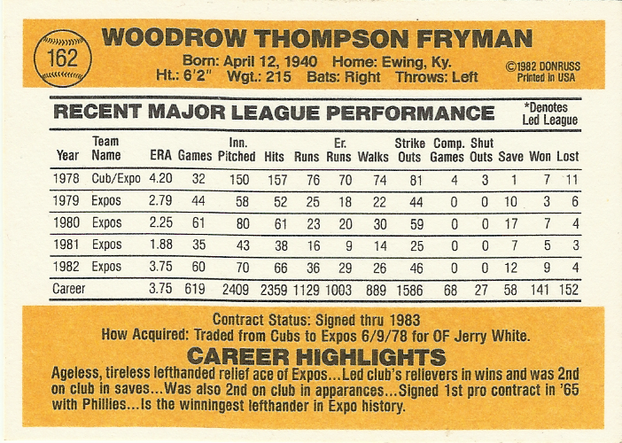
PLUSES - I have always been a fan of the glove because it i a very under-utilized design element for a baseball set. I also like the font used for the team name. The first time seen "How Acquired" line on the back is my favorite card back element of all time. The coloration on the back is probably my favorite of the entire "80's Donruss back" run.
MINUSES - The placement of the '83 should have be underneath the Donruss logo to match the '82 set. The bat would have worked better in several colors mixed throughout the set. It does get marked down quite a bit for the lack of creativity in the design.
14. 1982
PLUSES - Very simplistic design, but that's not necessarily a bad thing. I like the multiple colors used for the border, even if sometimes the color doesn't match the team. The back design is the beginning of a 10 year run, so you have to give it a little bit of credit.
MINUSES - Not a lot of credit though because the white letters on blue background has to have contributed to many sore eyes. Like 1983, the bat would have worked better in several colors mixed throughout the set.
13. 2014
PLUSES - I like the throwback to 1987 with the baseball stripe, with the added improvement of matching a team color. The semi-cursive team name really looks good, even though it does remind me too much of 1978 Topps.
MINUSES - If anything there are too many "nods to the past" mixed together. It's fine if Panini wants to completely start anew next year, but it's a bit cluttered this year. The border is too thick compared to the photo. I hate that the back does not have the How Acquired line included. The Panini logo is in a really bad place on the back. It should be buried next to the MLBPA logo at the bottom.
One thing I have often liked is the "bookend" quality of 1982 and 1983 Donruss. I realize that some people don't like it because it is not very creative, but I like the reciprocal factor of the two designs. It's not the best idea, but it's not the worst either which means I guess I have it well placed here in the middle third.
When I did the Best Topps Set Countdown back in 2012, I put the most recent set right in the middle just because I wanted to give it enough time for me to make a legitimate judgment on the design. I figured I would do the same with the newest Donruss set. If I were to re-rank the Topps sets again, the 2012 set would drop around 20-25 spots because I really have developed a dislike for it. Will the same thing happen to 2014 Donruss? To be honest, it probably will. I like the set just because it has brought back a lot of nice Donruss memories, but it does seem to have a lot of faults. What do you guys think?
Thanx for reading.


1 comment:
Good call on the border for this year's donruss set. I think it's a product of the no logo thing, though. They crop the pictures a certain way that minimizes the impact there - and I think the wider borders is part of that cropping.
Post a Comment