

I have wondered to myself when putting this countdown together how much uniqueness and being the first at something should be weighed. I like the sets that throw convention aside and take a risk. Sometimes it fails miserably, as is the case of 1957 Topps or more recently 1996 Topps. However, more often than not, the risk is well worth it. The first example of a color photo on the back pushed an otherwise lackluster 1993 Topps up the list and the first logo on the back pushed 1984 Topps higher. Even 2008 Topps was pushed quite a bit higher due to its unique attributes. That's why the last four years or so of the flagship has been kind of dull. They have mostly been conventional and not very memorable. They haven't been horrible by any means (well except for 2010), but they haven't stood out either. As we begin the top 10 sets of all time, there are a couple of examples in this grouping of a unique look. With that being said, let's take a look at the next set of five.
10. 1977

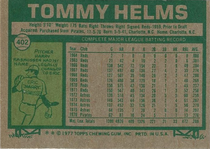
PLUSES - I love the large font color-coded team name at the top as well as the flag displaying the position. I also like the all caps name on the back, it really stands out in a positive way. For the era, the photography in this set is very good as well.
MINUSES - The dreaded return of the facsimile autograph just takes away from many of the photos. The cartoon on the back seems out of place in this set. I think it could have been left out.
9. 1987


PLUSES - The wood grain border is absolutely wonderful. The logo bubble is perfectly located and really enhances the front. Normally I am not a fan of the Topps logo, but I think it works on both the front and back of this design.
MINUSES - The lack of a player position on the front has always been a pet peeve of mine. There was a lot of bad airbrushing in this set.
8. 1964


PLUSES - The first appearance of the large font name at the top which has always looked good. All needed info showed up on the front. The back feature of the coin scratch trivia question was a good idea and really works with this set.
MINUSES - The back color is just downright ugly. Other than that there aren't many negative feelings about this set.
7. 1959

PLUSES - Fantastic colored inner borders work well with this set (even the pink ones). The telescopic view of the player gives me a bit of a "sneaking a peek" feeling, but in a good way. The little logo on the front pushes this set up as well.
MINUSES - I never liked that the first letters in the player's name wasn't capitalized. It would probably make the set a little less memorable, but it would also stop my grammar OCD.
6. 1971


PLUSES - The many firsts of this set. The first ever black border. The first ever player photo on the back. A nice risky set following several bad sets. The back in general is really different and works on most levels.
MINUSES - The one fault I have with the back is that there is only one year's worth of stats.
I really struggled with putting 1971 only at #6, because I do love the change involved with that set, but I just couldn't see any of the top five being displaced by it. Either way, each of these five sets is great in its own way. Some people might not like 1987, but you can't deny that it is a memorable and iconic set. 1959 is one of those sets that climbed my personal list because of Topps Heritage. As a kid, 1959 never really did anything for me. However, 2008 Heritage really opened my eyes to how good the design actually was. Has Topps Heritage changed any of your views on older designs (either positively or negatively)? Do you look for a set that either breaks a barrier or changes things up completely or does that even matter to you? Coming up next week will be the long awaited conclusion to this countdown which I have really enjoyed and I hope you will join me then.
1 comment:
1971 would definitely be in my top five, even with its subpar backs.
I still cannot figure out what the big deal is with 1987 other than there are a whole bunch of bloggers who started collecting that year. It's not original (it smacked of a copy of '62 as soon as I saw it) and it does nothing for me. I'll never try to complete it -- and I've tried to complete virtually every Topps base set from 1971-91.
Post a Comment