The reason I started doing this countdown was not to say that your favorite sets are bad or that my particular favorite sets are the best. I started this feature to get some dialogue going which some of you have done. I think one of the biggest areas of improvement for the blogosphere (myself included) is to get some back and forth discussions going regarding the big things (companies involvement, monopolies) and especially the small things (design, silly gimmicks, good gimmicks, whatever). Like most other people, I like standing on a soapbox and spouting off. But for this, I'd really like to hear more from you guys. Yes this is my opinion, but yours are just as valid because while I may be teaching some of you about certain sets, I'd also like to learn from you and perhaps take another look at a set (or sets) I may have taken for granted. Anyway, let's move on with the next group of five sets on my list.
#50 1982
PLUSES - The "hockey sticks" are at the very least interesting and different. That's a plus in my book. I actually like how the Topps logo is fit in on the front, without really hurting the photo in most cases.
MINUSES - I have never liked facsimile autographs on the front. Most of the time they impede the photo or look awkward like above. The blue on green writing on the back is perhaps the hardest ever from Topps to read. Overall just a really unmemorable type of set.
#49 2006
PLUSES - Decent photography for the most part. I particularly enjoyed the return of the cartoons on the back. The front design is actually not that bad, although with no foil on the team names it would be better.
MINUSES - Topps really "Upper-Decked" this set to death. WAY too many photos not matching the team name such as the above card. When the team didn't match, the color scheme was also off making team sets look ridiculous. The backs are too busy and I totally don't understand the duplication of a stat on the left hand side. Topps really shot themselves in the foot with this set, because it easily could have been better.
#48 1997
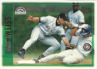
PLUSES - Pretty good photography in the majority of the set. I like the different colored borders/backs based on league (green for NL, red for AL). I think they did that because this was the year Milwaukee switched leagues. Easy to read card numbers.
MINUSES - The landscape-orientation cards are just horrible. The names are upside down in a page which just make it bad to me. The set was too small (495 cards) for a flagship set, especially in the expansion era. The foil first names are almost unreadable, especially on the NL cards.
#47 1961
PLUSES - The triple cartoon on the back is just great, but that was standard for the time. The baseball for the card number might be a bit overused, but it is still the best. Black on yellow makes for easy to read stats.
MINUSES - BORING!!!!! This has to be one of, if not the, least imaginative designs on a baseball card from any manufacturer. The personal info box seems way too stretched out. It could have been laid out much better.
#46 1960
PLUSES - I really like the logo placement in the diamond. Probably this set's best feature. I like the season highlights timeline. It is a better record of the player's season that just raw stats.
MINUSES - The worst part of this set is the alternating colors for the player name. Some weren't horrible, like the red/black combo above, but some combos made it nearly impossible to read the name. I realize at the time only nine categories of stats were listed, but only one year's stats definitely bring this one down a bit for me. The double photo on the front is not horrible, but the combo b/w and color photo just doesn't do it for me.
I imagine that there will be several of you surprised that 1960 is so low on this list. I honestly don't know exactly why I never liked it (well other than the reasons specified above), but I just never did. I can see how some of you might think more highly of it, but you're wrong (hehe). Other than that set, I really don't think the others should surprise any of you. But if they do, please feel free to argue for them or for any other sets that you think I may have overlooked. Next week's list will probably surprise a couple of people as well. But no hints.


3 comments:
the 1982 set is the first one that felt "vintage" to me as a kid, so that adds to the appeal for nostalgia. I started collecting with 1986 for what it's worth.
Also, what's wrong with me that I look at a set like 1997 and wonder why they would make a design that won't parallel well. I feel brainwashed. Maybe it should be higher because it stands on its own. Then again, it is fugly.
--Jon
@ Jon - I started collecting around 1986 as well. I didn't consider 82 vintage, vintage to me (as a kid anyway) ended at 1979 just because the decade changed.
1997 did have one parallel, the Topps Chrome set. The bad thing is the chrome set looked a lot better than the main set. Parallels should both look good and be slightly inferior to the main set in my opinion.
Except for 1960, these could actually be lower. I hated 1982. Not sure what grabs me about 1960, but it looks cool to me.
Post a Comment